

| |
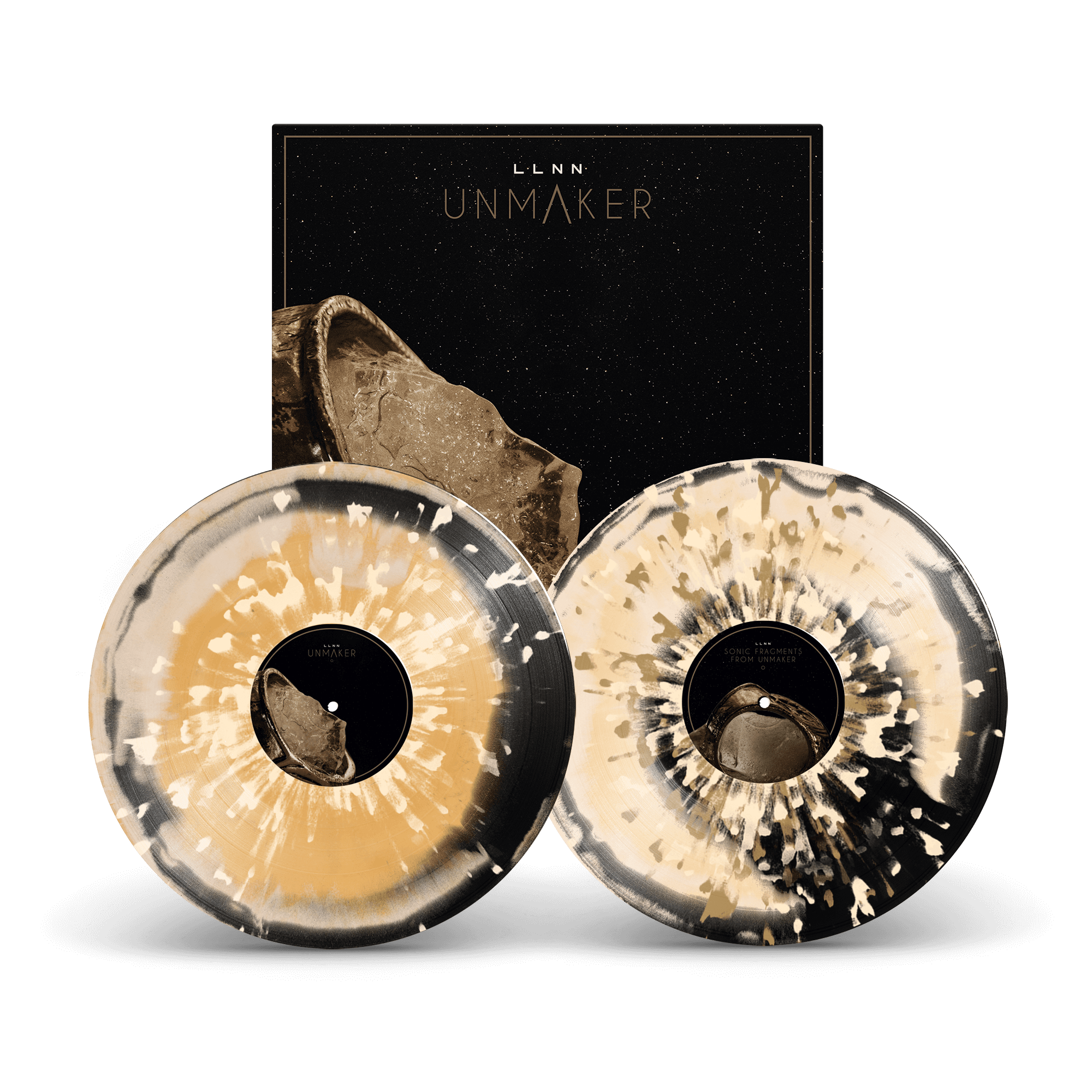
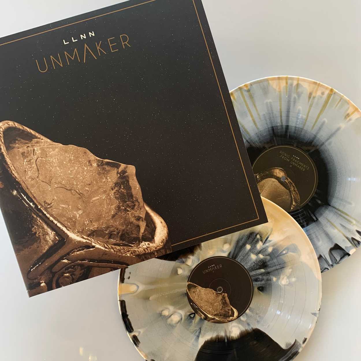
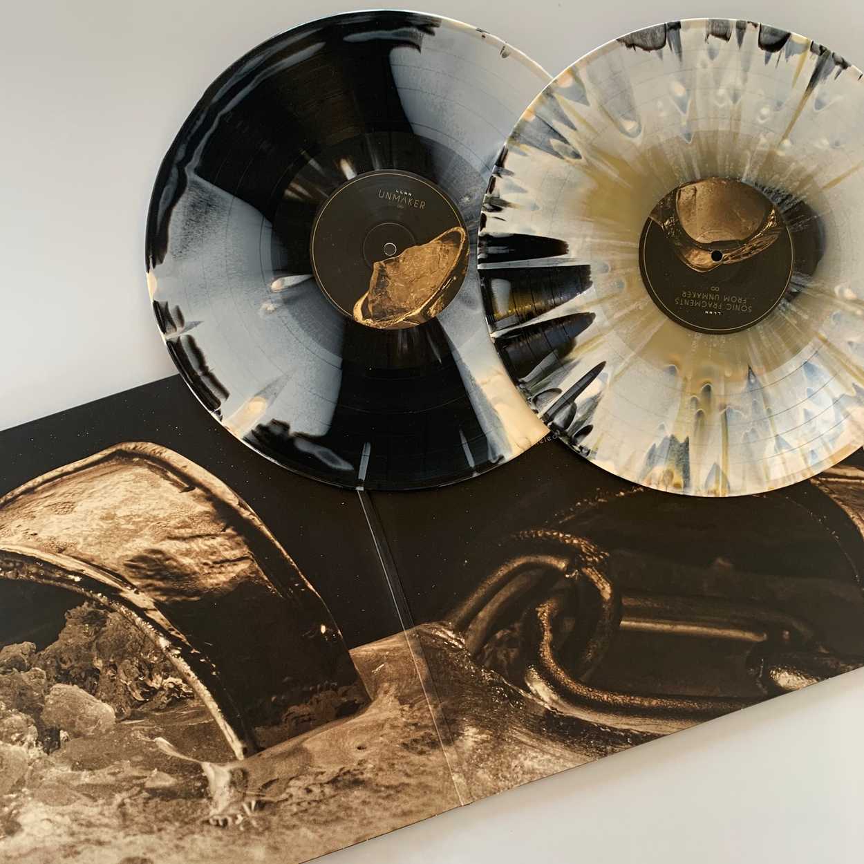
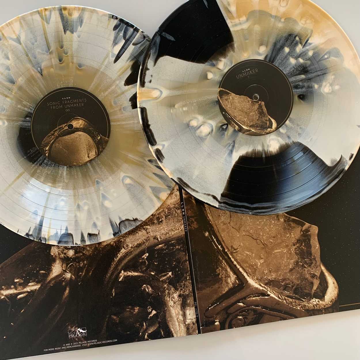
UNMAKER by LLNN
November 04, 2022
It is a great honor for me to have been selected once again to design an album artwork for the band LLNN, this time it was UNMAKER. As the band's fourth release and the third full-length album produced under the Pelagic Records banner, this project is the result of true collaboration.
From their first full-length album the band's drummer and all-around creative roundhouse Rasmus Sejersen has been providing his stunning creative photos used for the artworks. Moreover, the band has always been very hands-on in the decision-making, which I love, and had a clear vision of direction for each album, which I love even more!
Before-mentioned Pelagic Records, whos known for making breathtakingly beautiful releases, has also been instrumental in producing these beautiful albums, lending their ideas to really elevate the end result, just as I had the assistance of photographer and brand designer Marius Badu, whose portfolio among a vast variaty of different projects, includes the creation of Psyke Project's amazing DEAD STORM album artwork, making sure everything was ready for the printer.
If you are a fan of heavy atmospheric dark sci-fi sludge or are curious about exploring the depths of outer space with no way back, then checking out LLNN and clicking play above is no-brainer.
Inspiration
As always, the band was well-prepared for this project, with photos lined up and a general idea in place when they reached out. But as per also usual, we also learned a ton during our worksessions and meetings, about what actually worked, what didn't, and what could be applied where, and so on.
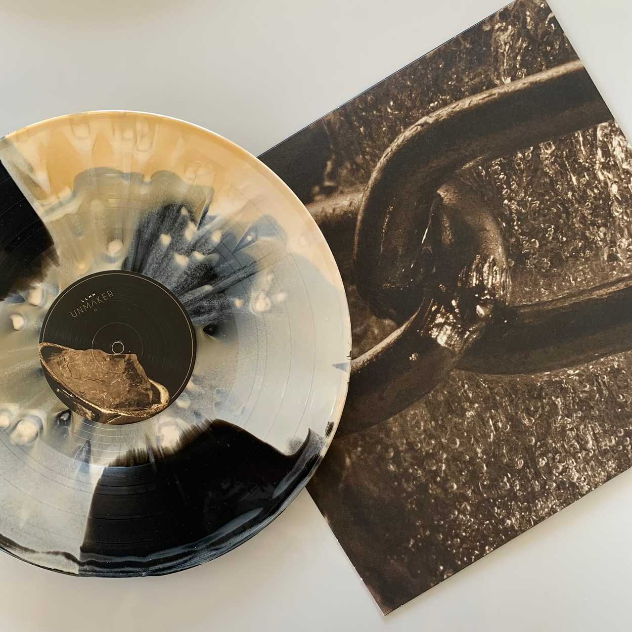
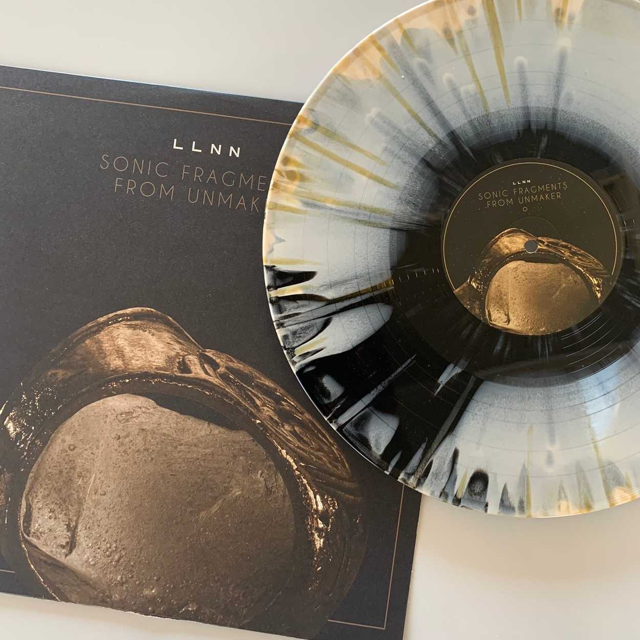
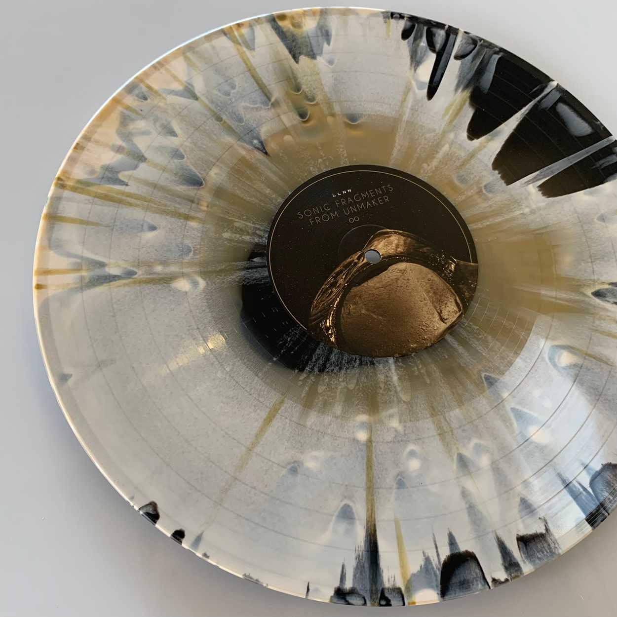
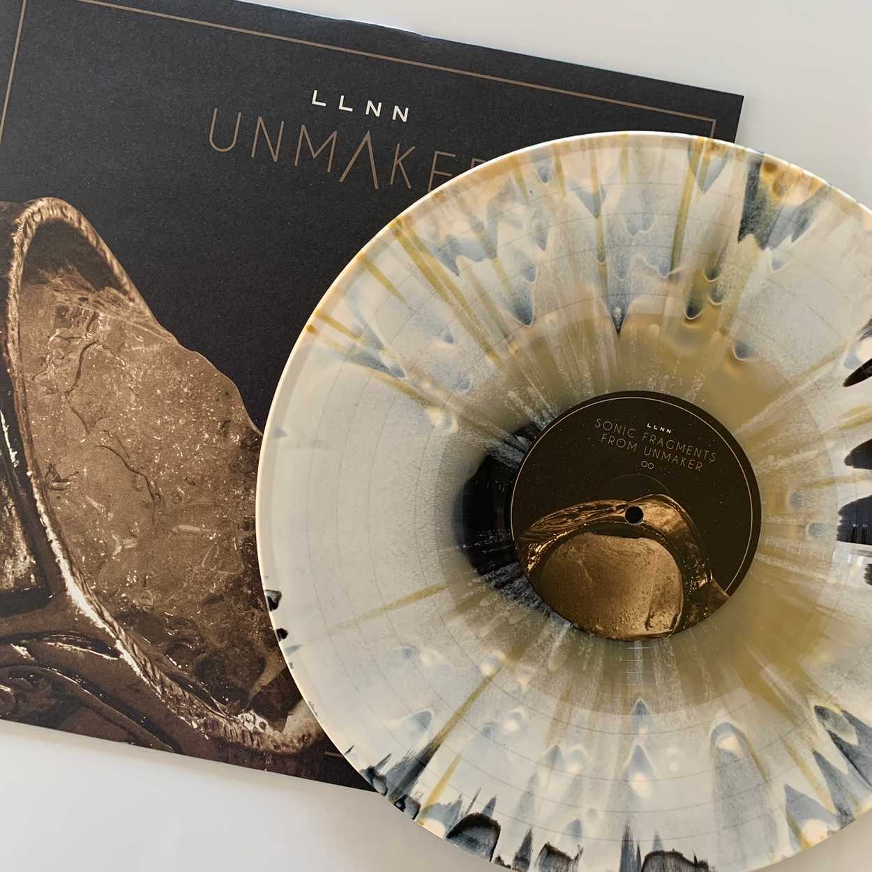
The limited Interloper edition of the release features SONIC FRAGMENTS OF UNMAKER - a second vinyl with the complete synth/electronical score for the album, produced by Rasmus Sejersen and his younger brother Ketil Sejersen under their Gravitated Soundstudio moniker. This also turned out to be the perfect working score to set the scene while making this artwork. A lesson I learned previously when making a complete game artwork, for a ficticious video game called Planet Unknown, with the inspiration 100% drawn from the soundscape by Gravitated Soundstudio's project of the same name. (Gravitated Soundstudio consists of the Sejersen brothers, also perfoming in LLNN!)

DOOM
Furthermore, it's no secret that the guys from LLNN are generally some nerdy dudes who loves everything that's the slightest video-gamey and the least bit sci-fi. If you are one of those as well, you might already have connected the dots, that the album title is a direct referrence to the eponymous unmaykr gun from the 2016 Doom Eternal video game - meaning all I had to do was blast either edition of the album on my speakers, play a little DOOM (for WORK!), and I was there in terms of inspiration! The DOOM style boomer shooter games are btw. totally among of my favourites!
But to be a little more concise in terms of inspiration, it has been drawn from everything from the visual styles from sci-fi movies/movie posters in the likes of Alien, Predator, Terminator, to the iconical directional styles and compositions of Stanley Kubric or John Carpenter, to retro video games like (obviously) Doom, Commander Keen (beleive it or not), Metroid, Halo, and (again) Alien, where "void", "empty", "dark", "suffocating" was among the defining words.

But more than that, a lot of the ressources and ideas was the same ressources we already had created beforehand. From the beginning LLNN have had a strong visual profile, but if you put up the LLNN albums side by side, they seemingly won't have much in common. A planet, a jelly fish, a chair at a beach and now a frozen something in the voids of outer space. They do have some elements drawing them together, and those silver linings are definitely intensional.
Since day one, we have used the same typography for the bands name - their "logo" if you'd like. It's kept this simple to reminisce the chunky fonts of old retro video games. And with the same reasoning I chose to reuse the the font used for both DEADS and MARKS for the title of the album, successfully tying this release into the bands brand as well. So the motives are different each time, it's more a given than the opposite, but the mystique about the motives are present every time.
I also chose to center pretty much every cover as well, a technique inspired by Kubric, while the front cover on each album always has been framed by a thin dirty gold* box.
Delivery
In the end LLNN and Pelagic was delivered print ready files for a tri-fold CD, a digipack CD case, a gatefold double vinyl with printed inner sleeves and with all the digital ressources, including color-grading/filters for photos to make further releases within the same "realm" i.e. those used for their digital singles, youtube-audio-videos and so forth, vinyl inner labels and disc design for the CD.
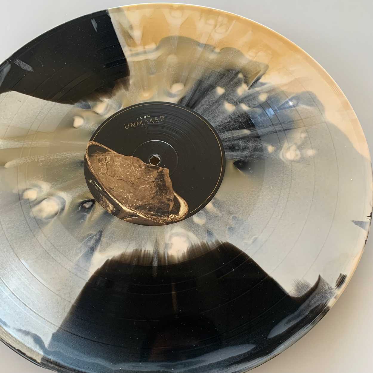
Below is an album showcase by Kamon Dubiel who was kind enough to lend me these beautiful images! Big thanks to Kamon, and please do check out their instagram - this is a very consistant source of vinyl-porn, and with a great taste in music as well!
Credits
Design/Layout: Mikkel Rask
Creative Direction: Mikkel Rask + @lillehomie // LLNN
Photographer: Rasmus G. Sejersen
Photo cleanup, edit and grading: Mikkel Rask
Print: Marius Badu (Design Proofing), Pelagic Records + GZ Vinyl (Print Proofing)
Showcase photos: Kamon Dubiel
*Dirty Gold is trademarked and is a specific Pantone color we did not end up using. Can't remember the actual color name, but it's refering to the the coppery/dark golden color we have kept their visual universe in, and it has in the production phases always just been referred to as the dirty gold